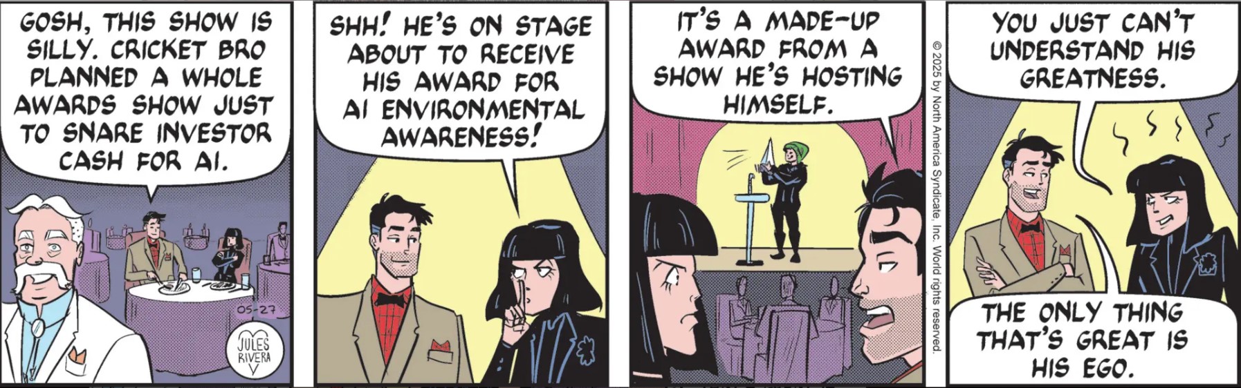
I posted this discussion separately, in order to focus on one visual aspect of Mark Trail: Jules Rivera’s increasing use of grays.
My regular post for 5/27/25 follows below. I’ve been noticing more and more the use of grays in the black & white newspaper version of Mark Trail. From a visual standpoint, this is a worthwhile improvement, as these mid-tones can help define volume, lighting, and even mood. Here is today’s strip as published in the usual “black & white” format of the newspaper. Compare it to the colorized version:

Do take into account that I’m photographing the strip with my phone, so there may be a certain loss of fidelity. Nevertheless, there shoujld be enough to clearly notice that Rivera is using grays to indicate basic contrasts between objects. In panel 1 a graduated gray pattern in the background helps establish the table lighting from the overall, darkened room. It is a mundane technique, of course, but given the stylized imagery that Rivera uses, adding mid-tones provides an improvement in the strip’s presentation.
Many strips today avoid shading, altogether, especially the majority of joke strips, where features such as tonality, volume, and mood may not be important.
However, even some continuity (dramatic) strips, where mood and lighting would seem more important, avoid tonality: Judge Parker is one example (click the images to see expanded versions):

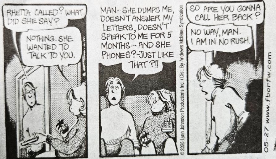
On the other hand, For Better or For Worse will use overlapping blacks, whites, hatching and grayscale patterns to evoke a more sophisticated setting of light and mood:
The avoidance of “shading” is often justified because of the reduced size of the strips when published in newspapers and the fear that scenes and figures will blur together, giving a less inviting appearance to the readers. There is some merit to that position. Like grays, I think there is a middle ground that can be staked out, and we should be glad to see Mark Trail making inroads in this direction.
Is all this just BS? Pretentious academic-speak wasted on mere comic strips? Let me know.