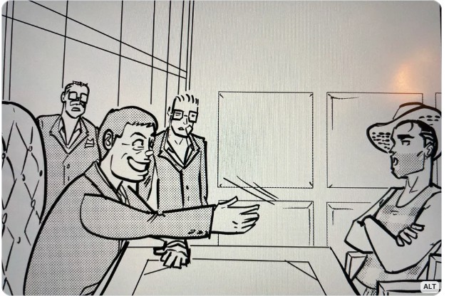
You heard it here, second, for sure: Jules Rivera just posted a panel from a not-yet-published daily on her BlueSky channel, showing Mark sitting in an office. He’s in conference with Tad Crass, while the two MMA fighters/security guards stand by, looking on in defeat. But Mark’s confrontational repose, refusing to shake Tad’s hand, is one of his best depictions. I’m anxious to see it in published form.
Now, let’s move on to today’s unfortunate installment:
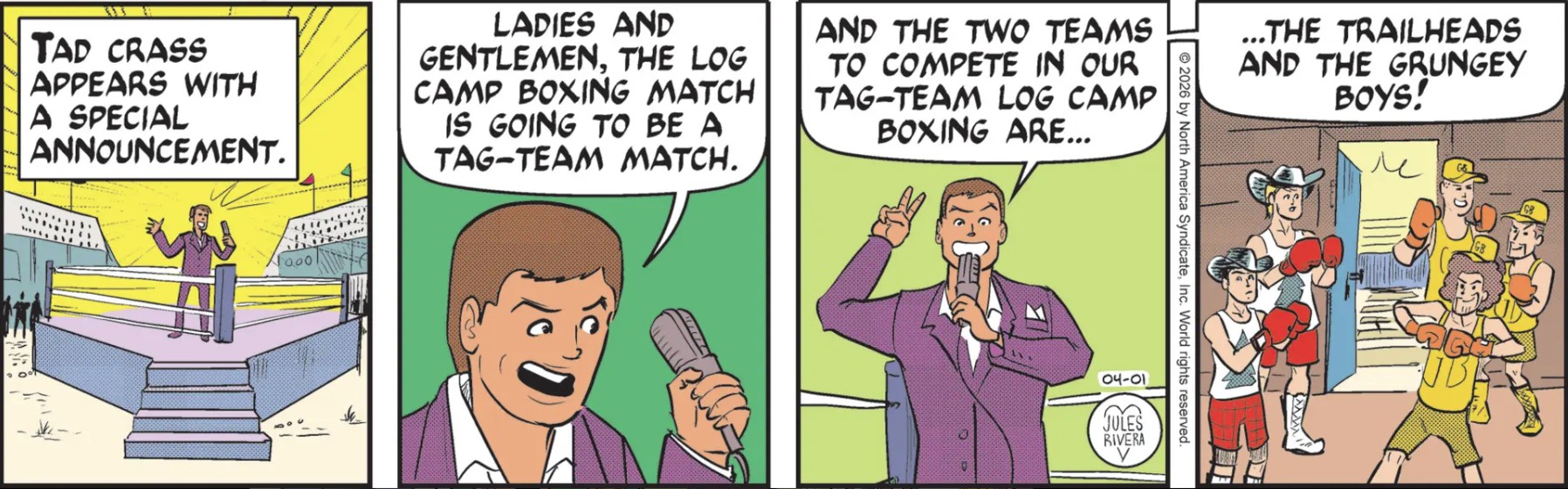
For Pete’s sake! We already know this so-called Woodsman Olympics competition is bonkers, and there’s no credit to me for predicting the obvious lineup for this “tag-team” boxing event. It seems that tag-team boxing is a real thing, though it is presented more as entertainment (“a fun sideshow”) than as professional, serious boxing. So it fits right in!
By the way, which Grungey Boy in panel 4 is Honest Ernest? I’m thinking it is the dude beside the door, behind Connor, though I really can’t tell. I don’t know whether Jules Rivera’s hijacking the nickname of traditional Mark Trail readers to use as Mark and Cliff’s “team name” is an homage or just part of this parody. What do you think?
Art Dept. More despair and frustration comes from Jules Rivera letting that same 12-year old kid who scribbled panel 1 in yesterday’s submission do the entire set of panels today. Do I need to go into detail? I think panel 4 is the worst, where a vague higher viewpoint has all of the guys almost stacked on top of each other, as if they were posing for some ancient Egyptian tomb painting. Never mind the disregard for relative proportions between the players. Never mind the sketchy drawing, overall. Never mind the clumsy composition.
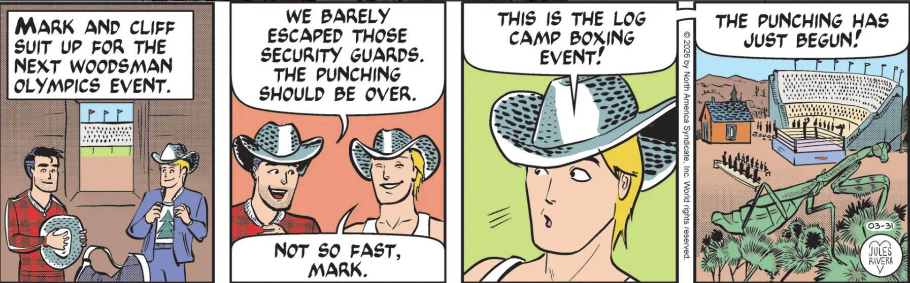
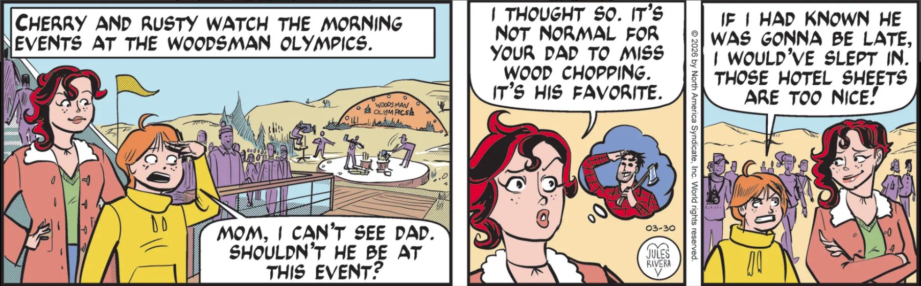
Mark and Cliff seem to be in a different competition area from where Cherry and Rusty are waiting in vain. I reckon that chopping wood wasn’t Mark’s favorite activity as Cherry claimed. One would think that after being married for however many years they care to claim, that Cherry would have a better understanding of Mark’s likes. Clearly, he prefers boxing … with his cowboy hat, no less!
If you think panel 1 looks like fan art from a 12-year old and that Mark looks like a real goofball in panel 2, I’d agree. It’s the “why” that is intriguing. In the Trailverse, we have a non-traditional woodsman olympics, held in a location with buildings of conflicting scales, where Mark has no idea which events he signed up for or when they are scheduled to take place.
As far as why this boxing event exists in a woodsman olympics, it should be apparent that Rivera put Mark into this situation where she can trade off of (or make fun of) Mark and his “fists o’ justice.” It’s a simple way to inject more “action” into the plot, even if it is unrelated to the story; much like various action scenes in movies discussed in Saturday’s voluminous comments.
Regarding this contest, I wouldn’t be surprised to see Mark matched up against Grungey Boy Honest Ernest. But you know what would be reallyinteresting: To see Mark matched up against Cliff!
Click image for enlargement. Remember to click the Back button on your browser to return to this page!
Mark certainly has put himself (and Cliff) in a precarious situation, vis-à-vis the competition. I wouldn’t be surprised if Tad Crass had Mark and Cliff ejected from the competition, though it still raises the question of why he accepted Mark’s application in the first place. Based on last week’s action, Tad certainly has not forgotten who Mark is.
Mark’s pursuit of Tad’s apparent skullduggery will also not likely mollify Cherry and Rusty, who could have found better things to do than hang around a wood chopping competition on their own. But that is not likely to happen, of course. Like Mighty Mouse, Mark will arrive to save the day! Or not.
If this was a live-action story, we’d be hearing a dramatic low-frequency rhythm gradually building up in intensity and volume as the contest continues and suspense builds. At the last moment the sound of a high performance car would fill the air along with some heroic music like Raiders of the Lost Ark, as Mark’s car suddenly appears from behind a sand dune, fishtailing and coming to a climatic stop alongside the competition area. Cherry and Rusty stand up and cheer as a grim Tad Crass and contest judges approach Mark and Cliff. The dramatic music returns.
Art Dept. I’ve discussed Jules Rivera’s convention of having characters appearing to look over their shoulders as they watch action going on behind them (panel 1). I presume it is either done because Rivera doesn’t want people to forget who the characters are; or she doesn’t much care to draw people from behind. Well, I don’t think there is any danger in readers not recognizing Cherry or Rusty from just about any angle. I just think it is a cheap copout.
Mark Trail used to epitomize—or at least advertise—“old-fashioned” morals and ethics. Not the phony kind that politicians trot out during elections, but the Norman Rockwell kind: respect, compassion, politeness, tolerance, and a willingness to beat the tar out of anybody that said otherwise.
Okay, maybe not the last one, but don’t hold me to it. My point? Thanks to the generosity of Tad Crass and his silent partners, Mark and his family received an expenses-paid-for trip to Las Vegas, free lodging at a themed hotel, free meals, and a free muscle car rental (at a premium rate), just to participate in a contest to win a tidy little sum of greenbacks. So what did Mark do?
Instead of thanking Tad for his generosity, Mark decided to skip some of the competition in order to investigate Tad’s planned sports arena because it competes for the same land as a planned solar energy project. We are all trying to figure out what is illegal or unethical in this conflict (other than solar energy is good and athletic arenas are nice, but expensive). But something weird seems to be in the wind, based on the activity this past week and on comments submitted to Saturday’s blog.
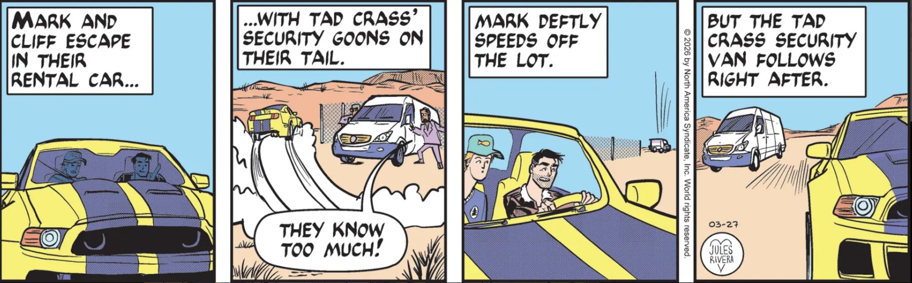
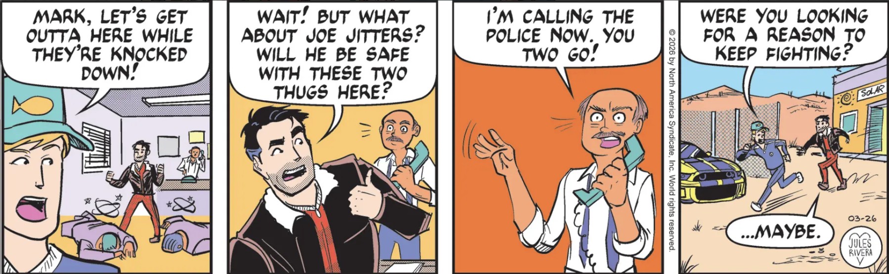
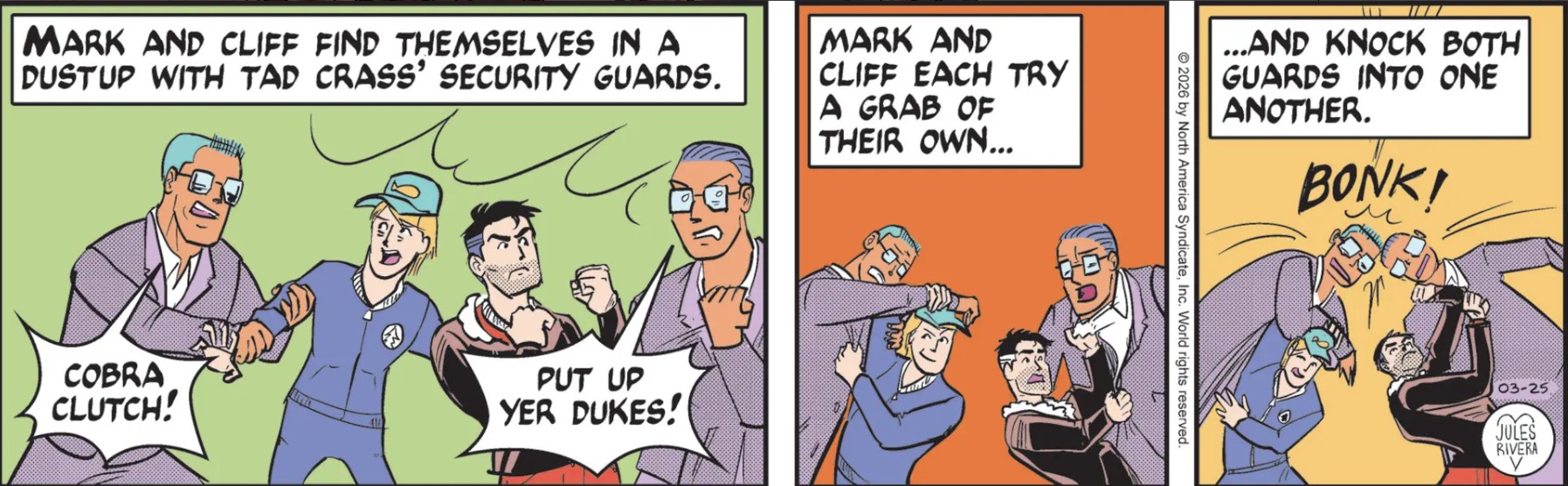
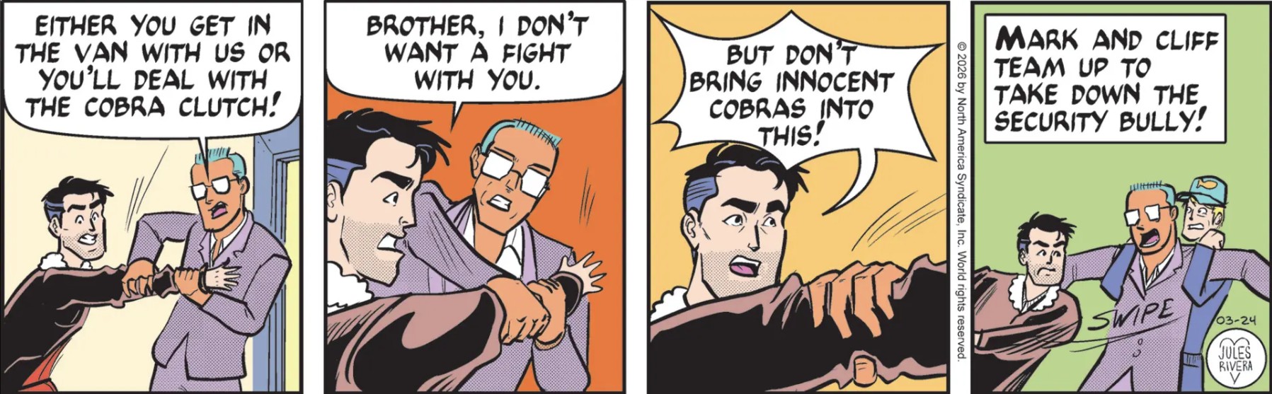
Mark and Cliff drove out to the solar energy project HQ to interview the project manager. In the middle of the interview, two really tall, big guys also showed up. They identified themselves as former MMA fighters now working as Woodsman Olympics security and it was their job to make Mark and Cliff return to the competition. I suppose it might have something to do with a commitment by Mark and Cliff, who are there on Tad’s dollar. There was some verbal back-and-forth that quickly turned to threatened physical force by the security guys. That led to the expected fight.
One might expect trained professional fighters would make quick work of Cliff and even Mark. But this is Mark’s adventure strip, so he and Cliff somehow overcame the two guys long enough to get to their car and bug out, supposedly to return to the competition, anyway! The two MMA-security guys quickly recovered and were hot on their trail in their own van.
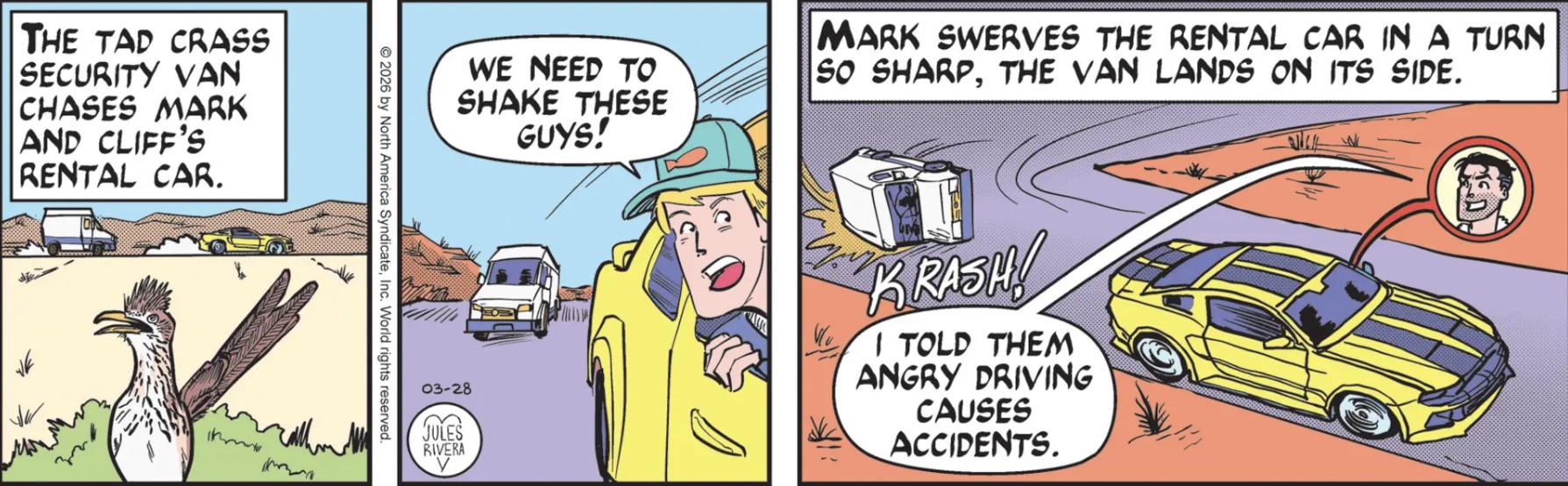
Mark’s Spidey Sense® about something suspicious must be on the mark, because the bad guys blurted out “They know too much!” as they chased Mark and Cliff. This is a clear indication that more is at stake than just a sports arena. But Mark’s luck held out again as the pursuit van rolled over on a sharp turn before they could catch up. Mark gloated as he left the van and its occupants behind, apparently uninterested in their condition. Am I being too hard on Mark?
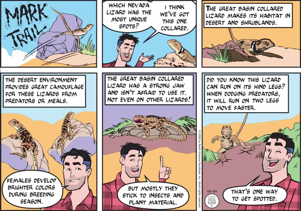
This lizard is also known by other names and exists in parts of several western states. One characteristic that may be difficult to illustrate successfully is the appearance of light-colored spots across the main body, while the tail may reverse the coloring of the skin and the spots. I’m guessing this is the reason for the “spots” around “Mark Trail” in the Title Panel. When the Roadrunner (seen in Saturday’s strip) is not avoiding Wile E. Coyote, it enjoys a good meal of Great Basin Collard Lizard.
I have the feeling that Jules Rivera used Hot Wheels models as her sources. They just look like it to me, even the van (which looks out of scale in panel 3). But that’s fine. A reference is a reference. Speaking of which, the allusion to the Roadrunner & Coyote cartoons is also obvious, along with the expected crash; though in good Roadrunner form, the van should have hit a mountain side. Like the Roadrunner, I suppose that Mark’s car can just make 90º turns at speed without swerving or running off the road. Of course, most car chases we see in movies are a time-honored way to stretch out the story.
There are few films where a car chase is an integral, effective story element: Vanishing Point is a classic example. The Italian Job is another. I reckon we have to include the Fast & Furious franchise, as well. But for the most part, car chases are gratuitous adrenaline fixes that action movies are just expected to include.
But I don’t understand how Cliff’s cap stays on his head when it is stuck out in the open like we see in panel 2. It would have to be so screwed down on his head that his hair would be sticking out sideways. I was also puzzled by Mark’s quip in panel 3. I looked back and didn’t see any advice Mark gave out on safe driving. Gosh, maybe he was just fibbing!? Anyway, I was hoping this chase would last a few more strips. It barely even deserves to be called a car chase.
At least we’re getting some action here, though only the visceral kind. The plot, itself, is still very vague, in spite of the security guard claiming Mark and Cliff know too much. Too much ofwhat, I wonder!? All we really know is that Tad Crass wants the same piece of land that a solar company wants, ostensibly for real estate development. It’s pretty thin soup, but action movies have been made with no more of a plot than this one. Anyway, let’s at least give the security guys credit for having greater recovery skills than fighting skills.
Mark hasn’t been involved in a car chase for quite some time (Do you remember the last time?!). The boys are in such a hurry to get away that they’ve failed to put on their safety belts, which might otherwise come in handy in a car chase. Still, that must be one supercharged van to keep up with Mark’s rented muscle car!
Of course this was bound to happen. Rather than develop a more complex plotline where Mark and Cliff are properly manhandled by these members of the Brute Squad and have to be brought back to the event in an unmarked van, Rivera decided on the simpler solution of “Mark Wins Again!”
Reader Hannibal’s Lectern wrote a comment yesterday in which he hypothesized that Jules Rivera depicted these security guards as bigger than Mark to symbolize their importance—or perhaps power—in the Woodsman Olympics hierarchy of characters (Go read the rest of his comment if you want the details). However, their physical (and symbolic) dominance didn’t help them. As we’ve seen in martial arts films, the tall and dominant fighters always wind up with their faces planted in the ground by the designated, shorter Good Guy.
Mark appears quite pleased with himself in panel 1, standing between the two security guys, as if he took them both down. Cliff seems to remark on that in panel 4, no doubt because he put in as much effort as Mark, but without the boasting. Are these two now going to race back to the Woodsman Olympics to try and get in a few events without getting expelled? Mark may well ignore his chances of winning the Big Money Grand Prize in exchange for stopping whatever is going on with Tad Crass. But what about poor Cliff?
This really isn’t Cliff’s fight. His kick is not fighting corruption; he wants that big payday. Yet he seems constrained to be Mark’s Faithful Sidekick, come what may. It’s disappointing that Rivera didn’t even bother to have Mark attempt to keep Cliff uninvolved so he could continue to compete and not jeopardize his chances or his liberty. Cliff should have been given a choice! Just who is the bad guy here, anyway?!
Yeah, I know. I expect too much. It’s just a comic strip.
I like how the sizes (or mass?) of the characters keep changing. And it’s very interesting that two martial artists are undone by a fisherman and a nature journalist. I reckon that makes perfect sense for somebody who possibly got their idea of fighting from watching The Three Stooges? Or maybe from fight scenes dawn by adolescent students, as I can attest. I don’t know how else to explain this. We don’t even have a clear notion of whether Tad Crass has done anything illegal or even unethical to warrant all of this, though it’s just a matter of time before Mark is again proven right.
Anyway, sending “enforcers” to track Mark and Cliff and force them to return to the Woodsman Olympics is outlandish. Still, within the absurdity of the story, maybe it’s not completely nuts. Heck, I think we all know that Jules Rivera’s version of the Trailverse is like a Bizarro-World of goofy characters and inane storylines that many Trailheads really dislike. Rivera’s Mark Trail is a refutation of Ed Dodd’s folksy world of environmental morality plays in the same way that the TV show Married With Children was a thumb put squarely in the eye of Father Knows Best.
Yes, Jules Rivera has moved into the “just plain silly” phase of the story. As it turns out, there is such a thing as the “Cobra Clutch”, but it appears to be a “pro wrestling” or Brazilian jiu-jitsu hold; and neither of those match what is happening here. Rivera must have recently watched one of the cheesier martial arts films where the fighters are always shouting out their special fighting techniques (“I’ll defeat you with my ‘Spitting Crane’ attack!” “Clever, but I’ll defend with my ‘Drunken Tiger Vomit’ kick!”)
None of this makes any sense to the story, unless it turns out that it is all a nutty dream that Mark has been having, after getting Cliff’s original phone call. But I doubt it. Wait … Is this scene borrowed from The Octagon film? Help me out; I just can’t remember.
So where is Security Guy Number Two? Maybe Rivera has him in the role of the martial arts Sifu, the master fighter who can only be faced after all of his students have been defeated (and the good guy is worn out). I reckon we’ll see about that tomorrow! But I’m suddenly inspired to go watch “The 36th Chamber of Shaolin”, starring Gordon Liu.
Well, it looks like Mark really is going with Option #3 as I laid out on Sunday (a choice also recommended by commenter Doghouse Reilly). Really, though, this is like those second rate action movies that show up all too often in our streaming feeds, where everybody is suddenly a martial arts fighter. Mark isn’t bothered by any of that, of course. He’s probably also never eaten anything more “Asian” than chow mein.
The point here is not whether Mark is playing fast-and-loose with the Woodsman Olympics by going after its host; it’s that Jules Rivera seems to be offering up this lazy plot twist as if it is some kind of cultural satire. Well, maybe it is. Or maybe it’s a double-twist surprise: In spite of Mark’s eye-staring battle in panel 4, the two security goons couldsuddenly start laughing and admit they were just play-acting for effect. Now, that would be a good joke.
Nevertheless, Mark hasn’t had much opportunity to exercise his two friends, so perhaps we’ll get to see a fight after all. And this could help Mark warm up for today’s Woodsman Olympic events. I wonder if Cliff will sit this fight out, like he did when Mark faced down the Grungey Boys on his own.
Art Dept. Sure, we know that Rivera is not trying to be “naturalistic” in the manner of Ed Dodd; and that her work is deliberately stylized and sometimes outrageous, like her stories. So, in panel 1 Cliff and Mark display indifferent, putty-like faces with ink drops for eyes. Is this to express shock or fear? Or just Rivera’s haste? OTOH, Mark’s face in panel 2 displays an attention to detail and personality, kind of like a young Bruce Campbell. But it is marred by an awkward beard design. You all know how much I dislike the technique Rivera uses to indicate Mark’s permanent 5 o’clock shadow. I much preferred her original stippling technique. But time is money, and I don’t think she gets enough moolah from her syndicate to warrant the extra time. So, let’s just get rid of the beard, Jules!!
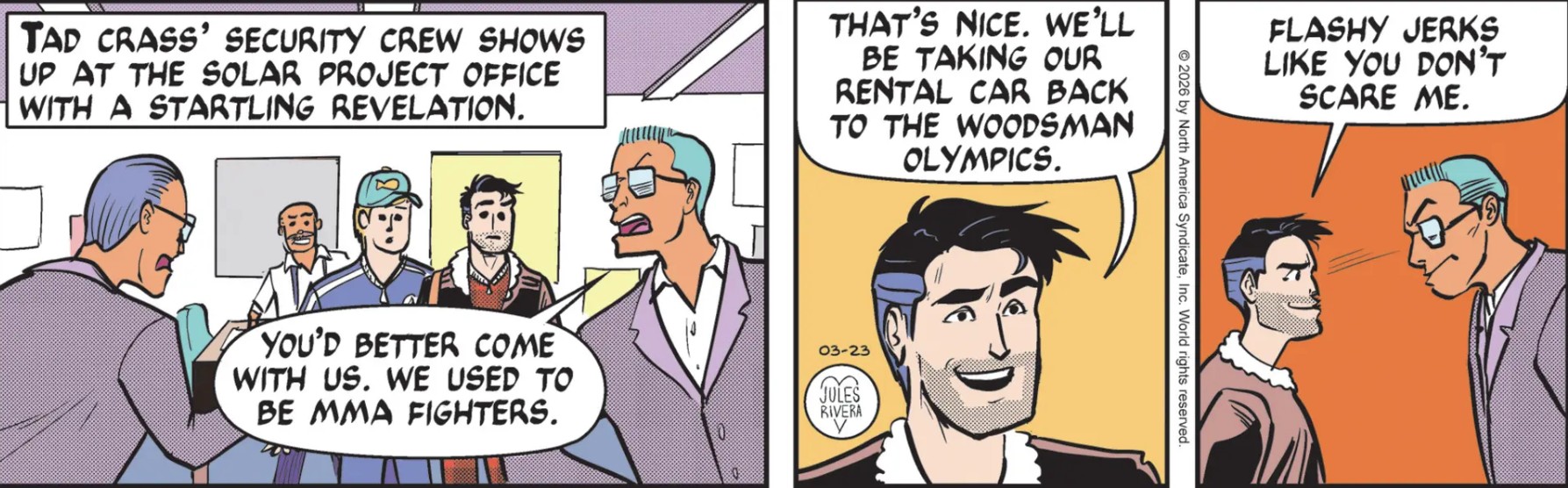
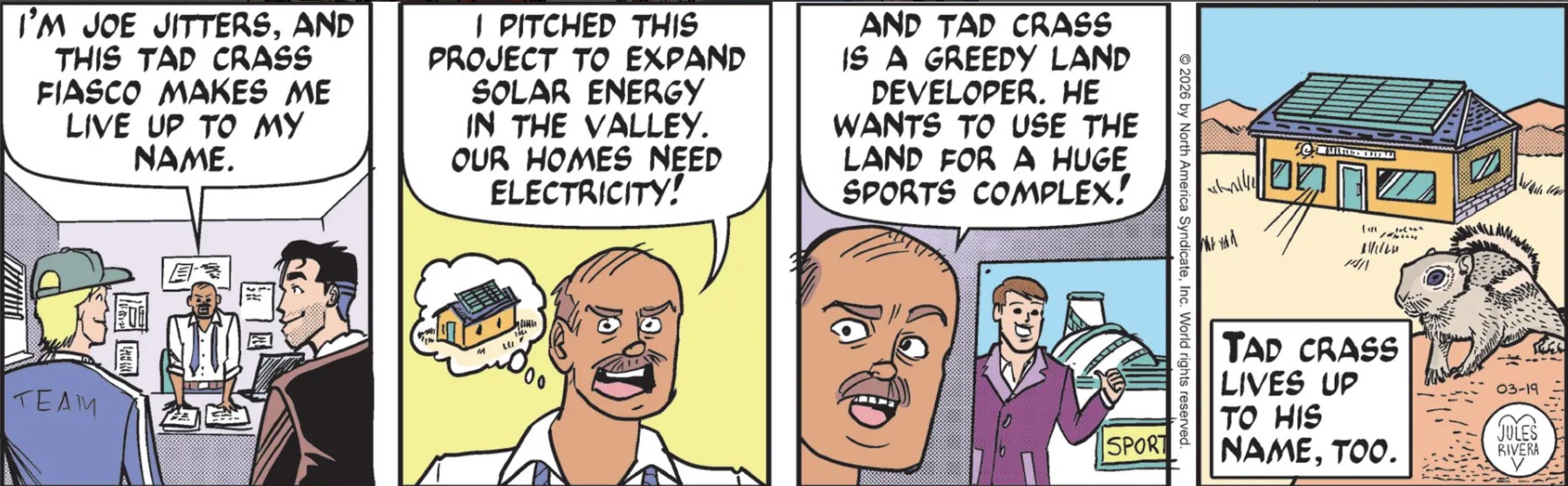
We’re back for Mark’s weekly segment, where we expected him and Cliff to be besting the other contenders back at the Woodsman Olympics. Instead, Mark was more bothered by hanky-panky going on in the desert, so he convinced Cliff to play hooky with him and go interview the Solar Energy Guy. It’s heartwarming to note that Mark doesn’t care one bit about getting Cliff into any trouble for not showing up at the Olympics. But Cliff is clearly a “go along to get along” kind of guy, and he has little enough to do in the story, anyway. After all, he even gets along with Mark’s rivals, the Grungey Boys!
They drove out to the “Solar Project” building to interview the project manager, Joe Jitters, who spent his time complaining how Tad Crass was trying to ruin his municipal solar energy project so that Crass could build his profit-generating athletic center. In case you were wondering, I already wrote about this issue before. What I since discovered is that at least 85% of the land is federally owned and managed for public use, conservation, and authorized development. So there shouldn’t be a problem here, right?
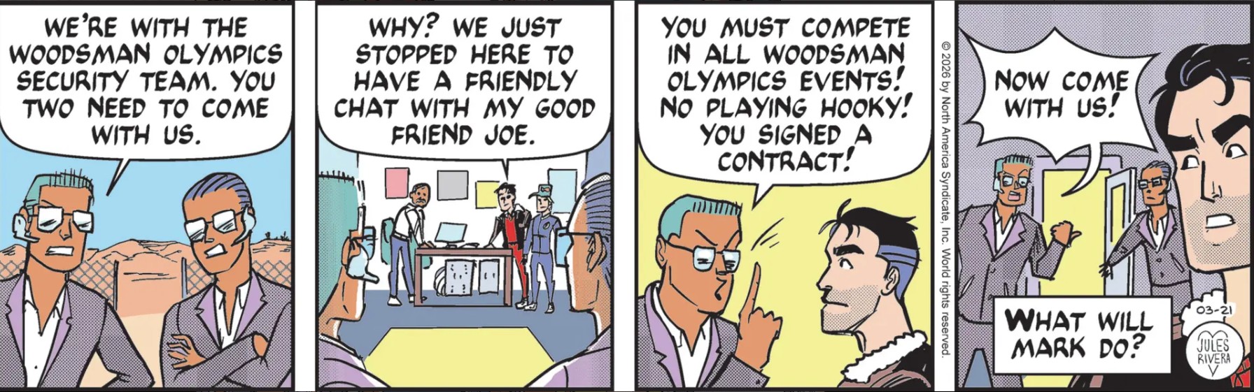
The climax of the week was the sudden appearance of two “Woodsman Olympics Security Officers” who somehow not only knew that Cliff and Mark were not at the event, but knew where they were. How!? I’m thinking Mark must have unknowingly rented his car from “Crass Car Rentals,” where every vehicle has a tracker installed. The security guys claimed Mark and Cliff were breaking the “I promise tocompete” clause of their participation contract. Now they have to immediately return to the event site! Jules Rivera left us with a Cliffhanger: What will Markdo now? I think his only choices are:
“Geez. Sorry, guys, our bad. Ooh! Would you look at the time!? Cliff and I are leaving right now!” OR
“No way, Jose! I’m going to destroy Tad’s plans for an evil stadium of profit! So try and sue us!” (Cliff mutters “What do you mean by ‘us’, Mark?”) OR
Mark takes off his jacket and says “Say hello my little friends, the twoFists o’ Justice!” (Cliff begins to sing “One fist of iron, the other of steel, if the right one don’t getcha, then the left one will…” ).
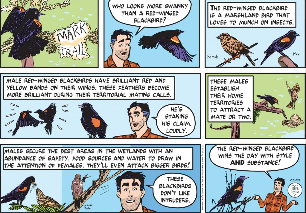
It’s difficult to come up with a great custom title panel each Sunday. Rivera often hits a good one, but today is a swing and a miss; but at least it is customized. Well, red-winged blackbirds are almost as ubiquitous in the States as Mark’s face is on these Sunday strips. I could do with less Mark and his asides and more Nature.
Sure, if they signed a contract, they are legally obligated to the terms of the contract. Can’t fault that. However, this little plot twist is, how shall I put it…weird!? We can all point out some obvious absurdities here, such as how this so-called “security” unit tracked Mark and Cliff in the first place. Skipping others, we move to the curious teaser, “What will Mark do?”
Clearly, Jules Rivera is riffing off of this blog site’s catch-phrase, “We need only ask, ‘WWMD’?” (“What would Mark do?”) I suppose I should be honored. After all, this is the only online blog that not only provides daily coverage, but also attempts to be even-handed about its coverage. (Don’t laugh!) Wait. Are you saying Rivera came up with that catch phrase on her own!?
Did I mention how these two security guys keep switching positions (compare panel 2 to the others), as if it is some kind of field procedure? Well, consider it mentioned! But, I do like their blue hair. Perhaps it is part of their company’s dress code. If I was Mark, I’d have to have a talk with Tad Crass or the head of security for these guys talking to them as if they were playing hooky in high school!
So the week ends on this little bit of suspense. Mark is thwarted from getting more informaiton from Joe Jitters and is being forced back into the games he agreed to participate in. But will he comply or risk it all for the extremely dubious prospect of finding something illegal or unethical that he can blow up? I mean, WWMD?!
One has to ask whether this disputed plot of land is the only place both projects could possibly use. I mean, there’s a fair bit of open land out there. Of course, that piece of real estate would be linked to existing demographic and business requirements. But is it the only such piece of available land? I’m guessing this is an irrelevant distraction to the story.
The storyline is not really whether there are other possible sites that could be used. It is who gets this site. The outcome on that is not in doubt, of course. Well, it would be significant if Tad Crass won in the end, meaning Mark Trail lost. Yeah, it would take a lot of guts for Jules Rivera to write that kind of story; but it would make an instructive, teachable moment to explore how Mark deals with defeat. It could even give Rivera’s incarnation of the Mark Trail adventure strip a much needed integrity boost by exposing its lead character as not the invincible, all-wins-and-no-losses guy he is presented as.
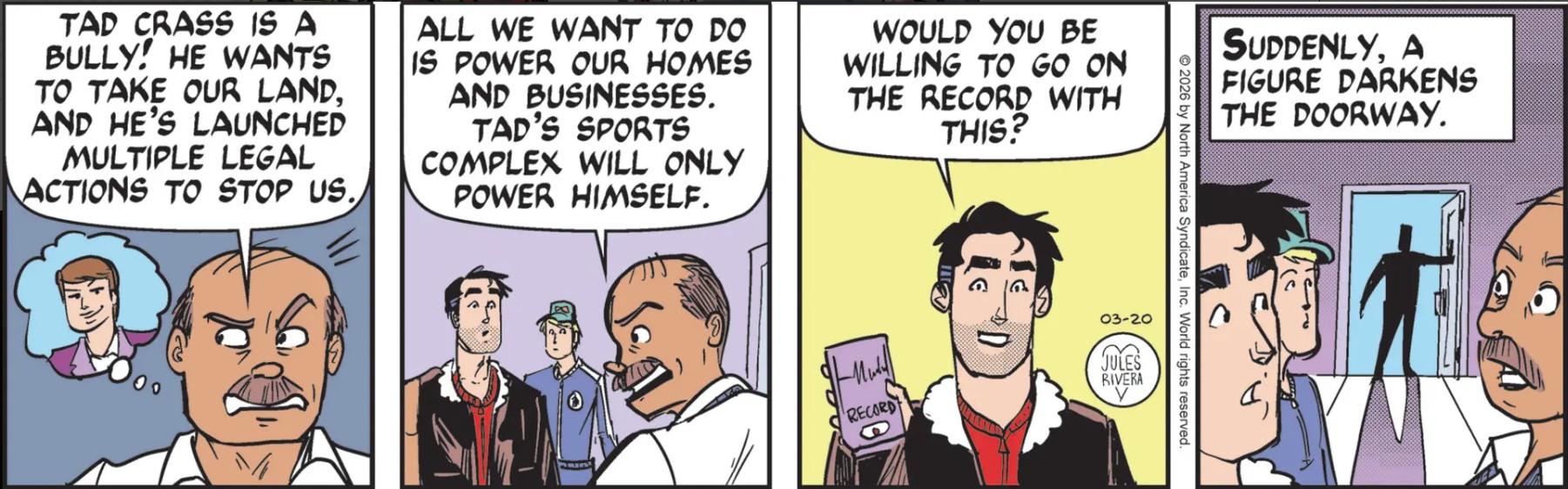
Winning all the time makes for boring entertainment. When there’s no real doubt or possibility of loss, there’s no real suspense. Whoever that guy is in the doorway (and gee! I just wonder who it could be!?), it really won’t matter. But if it is really Tad Crass, perhaps he will disqualify Mark and Cliff from the Olympics and send them packing back to Lost Forest. If only….
The interview continues, with Joe finally getting around to revealing his identity. Pretty “cartoony” imagery across the panels, today. For some unknown reason, Jules Rivera wastes a print day and our own time by having this Joe Jitters character repeat the same information about the land dispute that we already know. In short, Rivera is not moving the story along one bit! Why not?
What is the advantage of repeating the details of this land complaint instead of making progress to the story? Today’s panels could have been collapsed into one panel with a suitable narration box, such as “Joe Jitters explains the nature of his land fight with Tad Crass.” (Did you notice that I just did the same thing?!)
And as a “reporter,” Mark should be recording or at least writing down Joe’s comments. It’s not as if Mark has the ability to remember—in detail—all of his interviews. Mark used a recorder in Texas to interview Tess Tigress and her husband. He should at least be courteous enough to record Joe here.
I had to wake up before 5 AM yesterday for my flight back home. Don’t laugh; I’m retired! The automatic gangway to the plane at the airport wasn’t available, so we had to trundle across the tarmac and walk up an old-fashioned external gangway at 6:30 AM for the flight home. It would have been more fun without the windy cold and having to wait 5 minutes on the gangway while the flight crew did something mysterious inside the plane. I think they were hiding bags of ice for the drinks. Anyway, you get two posts for today. I hope you haven’t lost the plot. And if you happen to remember it, remind me!
Something Fishy
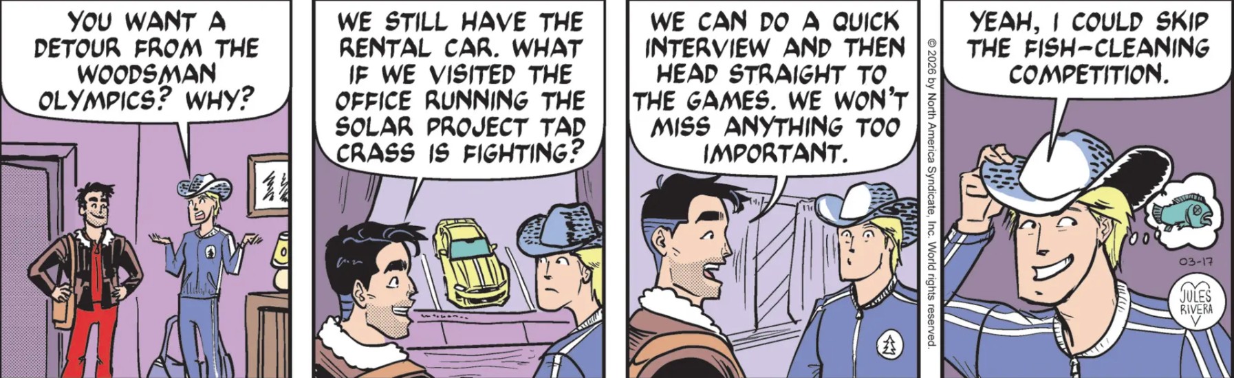
Mark is still fishing for anything that will give some justification for his snooping around. Mark’s behavior certainly seems disrespectful and flippant, given that his trip and lodging have been paid for by the Woodman Olympic hosts. Mark and Cliff are here to compete in events, but don’t mind skipping them. Did they forget about the big cash award for the most event wins!?
As for Cliff, his snarky comment in panel 4 is especially odd, given that his job is running a fishing lodge and being a fishing guide. The fish-cleaning event should be a Sure Thing for him. I reckon Mark is either jealous of Cliff or just doesn’t care enough. Why does Jules Rivera make Mark so egocentric?
Art Dept. Panel 2 is another example of how Rivera handles lookbacks; that is, when a character in the foreground observes something in the background. For once, Mark is already closely facing the rear window. His head is in profile because he is talking to Cliff. Cliff, on the other hand, is also more or less facing the rear window, but his head is turned strongly towards his left shoulder facing us, while his eyes are pulled to his right, looking out of the rear window. “Why not just show Cliff’s head turned to face the window?” you ask. Dunno! It’s the way Rivera likes to do it. There is some precedent for this weird anatomical twist. It shows up as a facial close-up in movies and TV, where a person has been surprised by a sound or voice, and jerks their eyes to one side without rotating the head. Of course, I could not quickly find an example to show you. Maybe you’ll have better luck.
Introductions are made
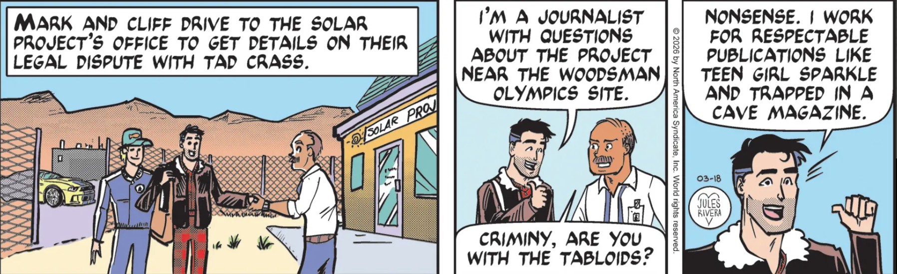
Okay, this is not even satire, much less parody. What legal dispute could Mark have? He has no standing in this situation at all. Isn’t that cute, the sign on the office is “Solar Project”, as if this is a diagram for a school science project.
I’m afraid that I have only negative comments today, which is boring and unhelpful. I said this was not even parody. Perhaps I should have written “not good parody”, given panel 3, where Mark describes his status like he’s delivering a joke. We might ascribe this to being self-deferential, but it comes across as unprofessional, supported by Mark’s and Cliff’s casual appearance and lack of any credentials. Any Internet Yahoo can claim to be a “journalist”, and no doubt, many do. Is Rivera trying to show this so-far anonymous employee is out of touch with contemporary society by his comment about “tabloids”, or does she think her readers still live in the 1970s?
Art Dept. Why are the three dudes standing “to the right of the front door”, rather than in front, as if they had to walk towards the side of the building before making introductions? Obviously, it is an artistic decision to show the name of the building. But it looks silly. Jules Rivera could have made a better composition by showing Mark from the backside meeting the office dude standing inside the open door.
Haven’t we seen Mark shake with his left hand more than once? Unless there is a physical impairment, left-handed shaking has been a longstanding trope of weakness and disrespect, at least within the male segment of society. Hanging your bag over the right shoulder does not count as an impediment, either. And the way it is drawn looks clumsy. The left hand should be crossing over Mark’s torso, except that Rivera has drawn Mark standing perpendicular to the Solar Project guy, not facing him. It’s another sign of disrespect. Perhaps Rivera is not aware of these symbols or she is deliberately manipulating them. And then, there is Cliff, who has this need to crowd Mark….see? I told you I have nothing positive
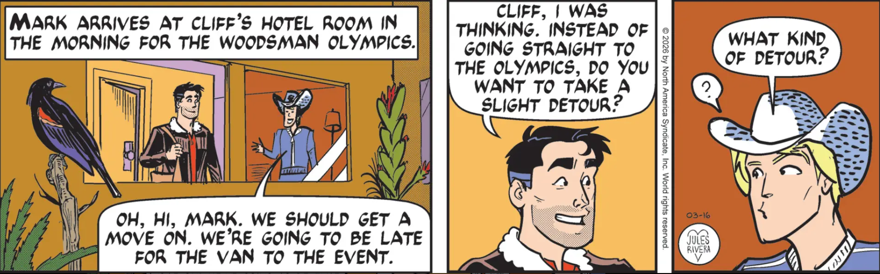
I like the idea of showing the arrival of Mark in Cliff’s room as seen from the outside. Aside from the interesting composition, the external view seems to create an illusion that we are spying on them. But that idea is destroyed in the other two panels, where the context is totally forgotten. But Mark has some snooping of his own in mind, I think.
Are Mark and Cliff headed back to that chained property, or did Mark come up with another lead on this currently non-existent problem? It appears that this scene takes place on the same morning that Cherry and Rusty went on their nature hike.
Last week, we saw Cherry reading in bed, obviously alone, as she and Rusty planned the nature hike for the following day. This would be about the same time that Mark and Cliff were investigating Tad Crass’s locked-up property. And now, Mark is ready for another day. Apparently, Jules Rivera decided to cut some domestic bliss and hotel events from the story in favor of focusing on the ongoing action of both Mark and Cherry.
That’s an interesting omission, as in previous stories, Mark would call up Cherry in the middle of a story to check in and at least summarize what’s going on. This was done in Mark first adventure under Rivera and at least another time, during the phony Tiger Touch Center that introduced us to Tess Tigress. But for some reason, neither of them is bothering to check in with the other.
Okay, it’s the following day and we are going to follow Mark and Cliff this week, then possibly return to see what Cherry and Rusty have been doing at this time. And we still have not seen the return of the Grungey Boys. Maybe the are working with Tad Crass!?
Hoo boy! Maybe I just don’t have enough to do in my own life that I can sit around and synchronize the chronologies of separate comic strip characters!
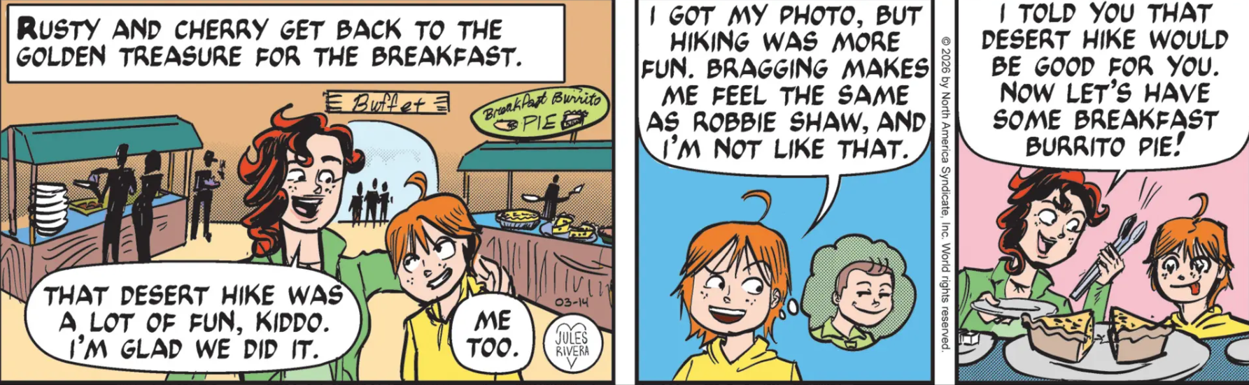
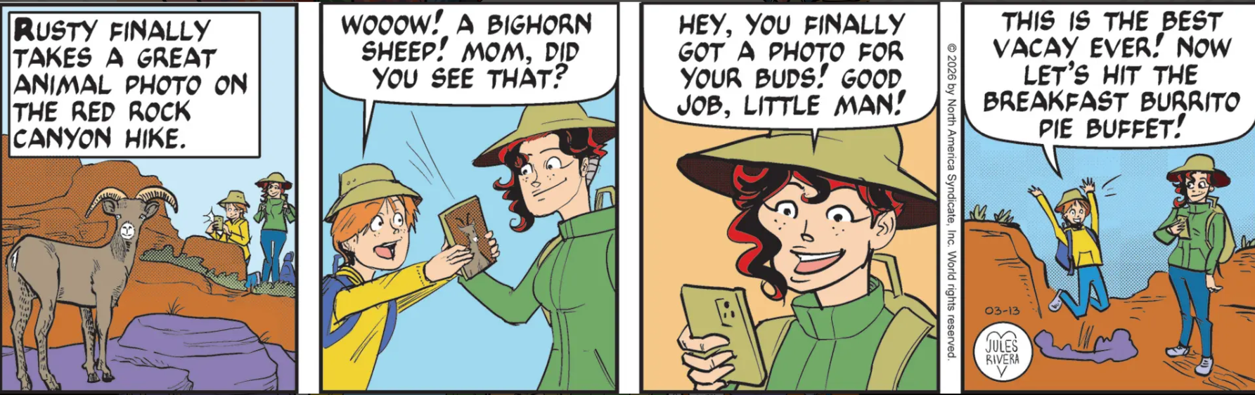
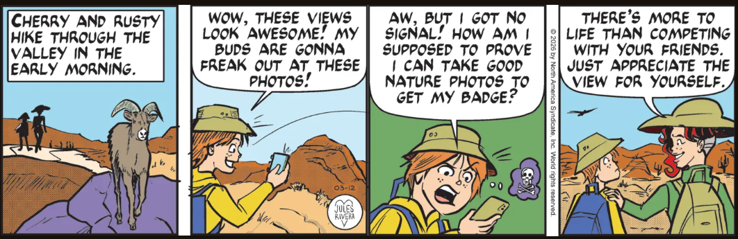
Well, the happy-go-luckier side of the Trail Family—Cherry and Rusty—went on a nature hike to enjoy the environment and provide an opportunity for Rusty to get some good nature photos he can use to win a scouting badge.
This trip turned into a morality play (or perhaps a 1960s family sitcom), as Rusty started out vowing to get photos he could brag about, but ended up just appreciating the hiking experience for its own sake, while disavowing his earlier bragging attitude he linked to being like Robbie. It was a real Hallmark Moment (cue the strings).
As for the hike, unfortunately nothing unusual happened. Rusty’s moral lesson is the best we’re going to get. The two even got back to the luxury hotel in time to get their breakfast burrito pie in a room the size of an auditorium (as be ware of eve hill noted. BTW, there are some other interesting comments posted to Saturday’s blog. I was going to say that I was jealous and wished I had thought of them first, but then I recalled Rusty’s self-awareness lesson. Rats. So all I can do is salute the cleverness of my readers and commenters. Bastards! 😊).
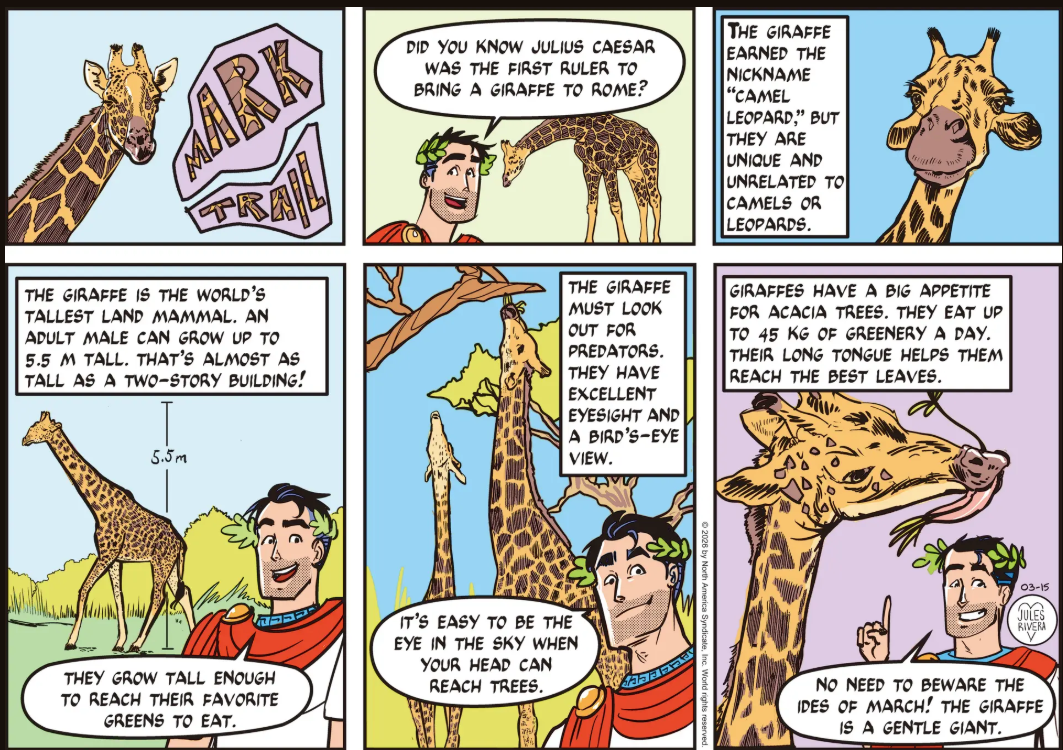
Well bravo to Jules Rivera for her history-linked nature chat for today! The giraffe was a gift from Caesar’s current main squeeze at the time, Cleopatra, the seventh (and last) Ptolemaic queen in Egypt to bear that name. And today is the Ides of March, the day in 44 BCE (two years after Julius went to the trouble of shipping the animal to Rome) when Caesar was assassinated. Some gratitude! By the way, I’ve watched nature-cams of giraffes at watering holes in Africa. One animal usually keeps its head raised at all times to provide a lookout while the rest drank. They would take turns as lookout.
Group bus? Private car? Chartered helicopter? E-bikes? I reckon we don’t need to know just how they got back, only that they did get back. And their little adventure was a little shy of adventure and drama, as well. I was hoping that one of the Grungey Boys (the one who has no name and never speaks) might have infiltrated the group hike and tried to cause some mischief. On the other hand, the week gave us the opportunity to rest up for the hair-raising drama and suspense that Mark and Cliff now find themselves in. So I hope you took advantage of this break to get in a little work around the home, read some history, or finally trim those toenails (such a pain).
Art Dept. Yes, I know. You could write this section as well as I could. Maybe better. And I’m not referring to panel 1, which is not completely chaotic, though it looks pretty low-rent, like an Interstate motel. I also don’t mean those weird lines that Rivera occasionally draws over and under Cherry’s lips. Whatever they are.
No, I’m referring to that drugged-out, acid-trip fourth panel. The harshness of the lines, Cherry’s aggressiveness, and Rusty’s expression are scary. When I first viewed today’s strip, I thought Rusty looked like he transformed into a character from the Walking Dead. It might not be a good idea to feed any burrito pie to the lad. Besides it’s probably about 2300 calories a slice.
Red Rock Canyon?! Well, that’s some 26 miles outside of Las Vegas. But why not? There are no mountains in town and hanging around the Strip in the daytime is nobody’s idea of a great time. The town is made for the night. Just ask the women who wander the sidewalks at night, handing out solicitous invitations. You don’t see them in the middle of the day. Well, not when I was there. I mean, I don’t think they were avoiding me or anything, but, uh … oh, it’s not important.
Does the hotel offer free rides to the canyon? Perhaps a hotel shuttle? It’s a bit far to take a Lyft. And speaking of lift, I doubt Rusty and Cherry got a lift from Mark, either. Say, I wonder where Mark and Cliff were last night, after they returned from their field trip. Cherry and Rusty don’t seem to be bothered by Mark’s absence. We’ve seen no evidence of familial or marital issues, so we must assume that there was a decision that this pseudo-vacation should be treated as if Mark is on assignment and they are on their own. Just as well, because had Mark tagged along, he would have found something to complain about or want to investigate, and there goes the day!
I’m not sure where that crowd of anonymous walkers that we saw on Wednesday wandered off to. But let’s hope they didn’t take all return to the hotel in the alleged hotel shuttle, leaving Cherry and Rusty stranded in the desert, 26 miles from Las Vegas, without phone service. Hmmm, I begin to see a plot unfolding.
The pacing of this nature hike adventure has been slow. Jules Rivera spent two days just to get the idea of a nature hike across to Rusty! This is Thursday, so there are two days left in this adventure. Will there be a dramatic cliffhanger on Saturday, or will Cherry and Rusty simply return to the hotel <yawn!>, perhaps to run into Mark and Cliff?
As we ponder the possibilities, we should at least agree that it’s not always old dogs that can’t learn. It appears that Rusty didn’t learn his lesson the first time and is trying to repeat the same actions that caused him much grief. Only the limits of technology saved him from once again posting his photos online, where his rival, Rob, could once again present them to his dad as his own work. We already know that his father, Ranger Shaw, is not only the scout leader, but is also corrupt. At least biased.
Art Dept. Some strange drawing in today’s panels! In panel 1, it looks like Cherry is wearing the bicorn dress hat (“la lucerna”) of the Italian Carabinieri. In panel 4, the hat takes on a scale that exceeds Cherry’s head. Sorry, it just looks wrong to me!