

I thought I’d try and show today’s strip as close to a newspaper format as possible (they are not all exactly the same, of course). I think it is good to keep that in mind when we’re looking and critiquing the panels. That is, when the strips are published online, they tend to be so much larger than they are when printed, and cartoonists, by and large, draw with the understanding that they will be significantly smaller than the original drawings. So here is the same strip, as seen on the Comics Kingdom web site:
The proper “focal point” for viewing a drawing is important. The famous 19th French artist Georges Seurat painted small dabs of complementary and contrasting colors laid side-by-side and overlapped so that, when seen at a proper distance, they visually blended into other colors and shapes. This was a deliberate technique on his part.
My thought is whether we should continue to post and view these panels in their online size or the newspaper size. I think in the latter case, a lot of complaints about artistic style or quality are minimized, so to speak. That is, images do not look so stark or odd. And that is likely deliberate, as Rivera is well aware of newspaper size reductions. Anyway, is this a valid observation or am I just talking myself into a rhetorical corner?
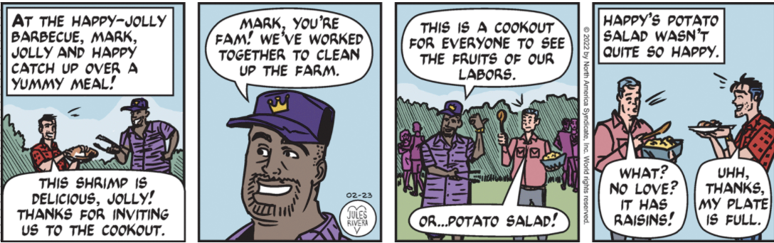
Hey, I almost missed it: Mark is wearing a short-sleeved version of his standard red-and-black checked shirt. Maybe he really does have a closet full of them for all seasons.
