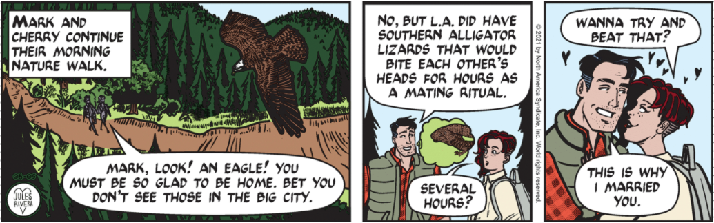
I had brought up before the issue of coloring and how it can affect (pro or con) the appreciation and interpretation of a comic strip ; and I wrote a bit on that in today’s blog. I remarked specifically on the tree line in panel 1 being the same color as the background, which is not that common in Rivera’s panels, and how it tended to hide details and minimize the depth of field. However, I looked at the strip as it was published in black & white in my town newspaper and found what I think is confirmation:

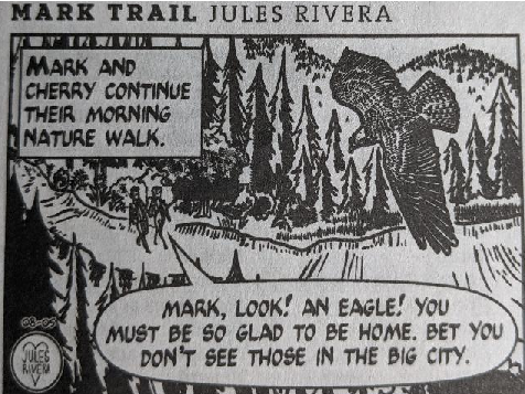
Well, newsprint certainly lacks the luster and brilliance of a direct-from-screen image, doesn’t it? In spite of that (and my less-than stellar photography), I think it is interesting that the trees become more obvious and “closer” in the black & white version, with the forested mountains clearly in the background. Details of the eagle’s wings are clearer, as well. So here is one case where (the choice of) color may not have improved the artwork.
But, what do you think?