
We have a week of Rivera parodying NFTs and their seedy, single-minded entrepreneurs, using the convenient made-to-order idiots, Professor Bee Sharp and Cricket Bore. Somebody on CK questioned the identity of the animal in panel 1. Did that query intend to suggest that the two goose heads were somehow part of the head of that animal? We have to wonder whether Rivera deliberately composed them with that in mind. In any event, they certainly are two very tall geese! Frankly, I have no idea what that lumpy brown animal is. I hope somebody will educate me and the rest of us. By the way, is it me, or does it look like Professor Sharp is exposing himself to the goat in panel 2?
Unfortunately, I think there are some qualitative differences in today’s strip, especially compared to previous days. Let’s compare panel 2 today to yesterday’s strip (I am also using the second panel):

Wednesday’s panel is the left. Compare the photographer in both scenes. On the left, notice how his hand displays reasonably realistic bone structure, knuckles, and “feel.” On the right (from today), the photographer’s body takes up about the same amount of space.
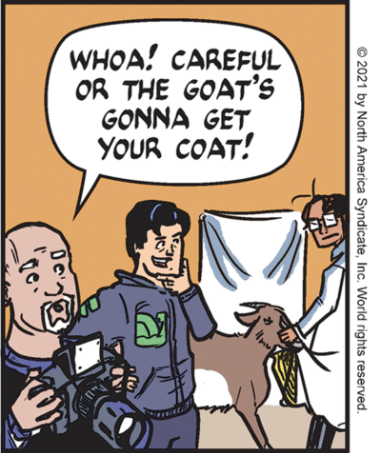
But his hands today display no sense of bone structure or knuckles; they look flat and clumsily drawn. There is also a disregard for detail in the today’s face, compared with the one from yesterday. The camera looks out of proportion. As for the other two figures in today’s panel, they are also drawn in a clumsy, amateurish manner. Sharp’s head looks like somebody with a toupee that is falling off. Cricket Bro’s head and left arm are an effort.
Now, as long-time readers know, I have largely been a champion for Rivera’s art and overall approach, not only for the overall style, but also for her often-interesting compositions and expressive details that help define mood and action. However, what I see today bothers me, insofar as I don’t know if it is due to rushed deadlines, less-skilled assistants, or something else. Everybody has bad days and this may have been one of them. Rivera is usually much better than this, so when I see what appears as slapdash work, it saddens me, in part because it provides fodder for the complainers who prefer the 19th century illustrative style of the prior Mark Trail cartoonists…which they also complained about (as did I).
Finally, this awkwardness is odd, since it is not apparent in the other two panels, save for that weird juxtaposition of animals in panel 1. In fact, I like panel 3 a lot for its composition, facial expression, and the excellently-drawn foreshortened arm. The panel is first rate. So, what are your thoughts? Am I off the mark?

Looks like a capybara. They’re becoming urban pests – might be a sunday story
LikeLike
Ah, you might be right. I completely forgot about them. Thanks for the catch, Downpuppy, though it does kind of look like it was carved from a potato!
Still, perhaps this is a rare sub-type: “Capybara Chimera”? :)
LikeLike