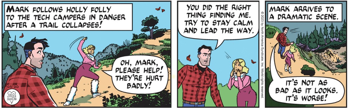
“It’s not as bad as it look. It’s worse!” Call me Mr. Ignorant, because I’m not sure what that means. Is Mark being sarcastic? Sounds contradictory to my pea brain.
Well, that’s a well-drawn terrain in panel 1, by the way. Good variety in flora and perspective. The bird’s-eye-view in panel 3 is another welcome return to Rivera’s early use of varied viewpoints to highlight a story. It’s good to see her getting back to some more creative compositions, rather than the flat, straight-on close-ups she has been using for a long time.
But the characters look different, especially Holly Folly. There’s her strange posture in panel 1 where it looks like she’s falling over. We can possibly excuse the crude images of Sharp and Cricket Bro at the bottom of the hill in panel 3, owing to the very small size the panel has to be.
Another remarkable thing (to me) is seeing Mark’s normal rough stubble suddenly looking like a smooth, carefully tailored “5 o’clock shadow”, defined using an old-school ziptone-like pattern. Back in the day, several cartoonists used specially printed transfer sheets to apply patterns to their drawings, largely as a replacement for hand-drawn shading. This technique has largely gone out of fashion. Rivera draws on a computer, so the beard pattern is rendered digitally. I assume that Rivera is experimenting with her style. So far, I prefer the hand-drawn stubble.

